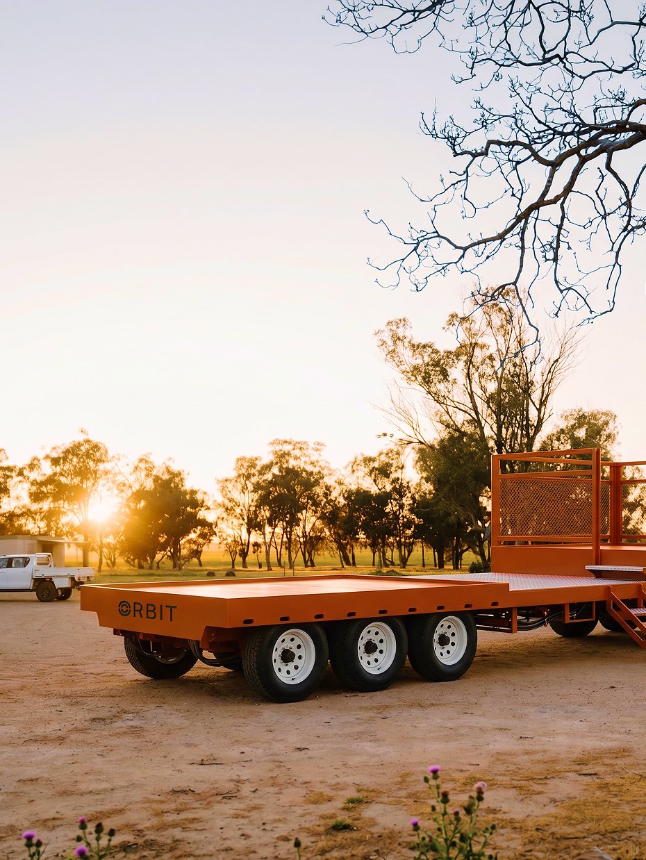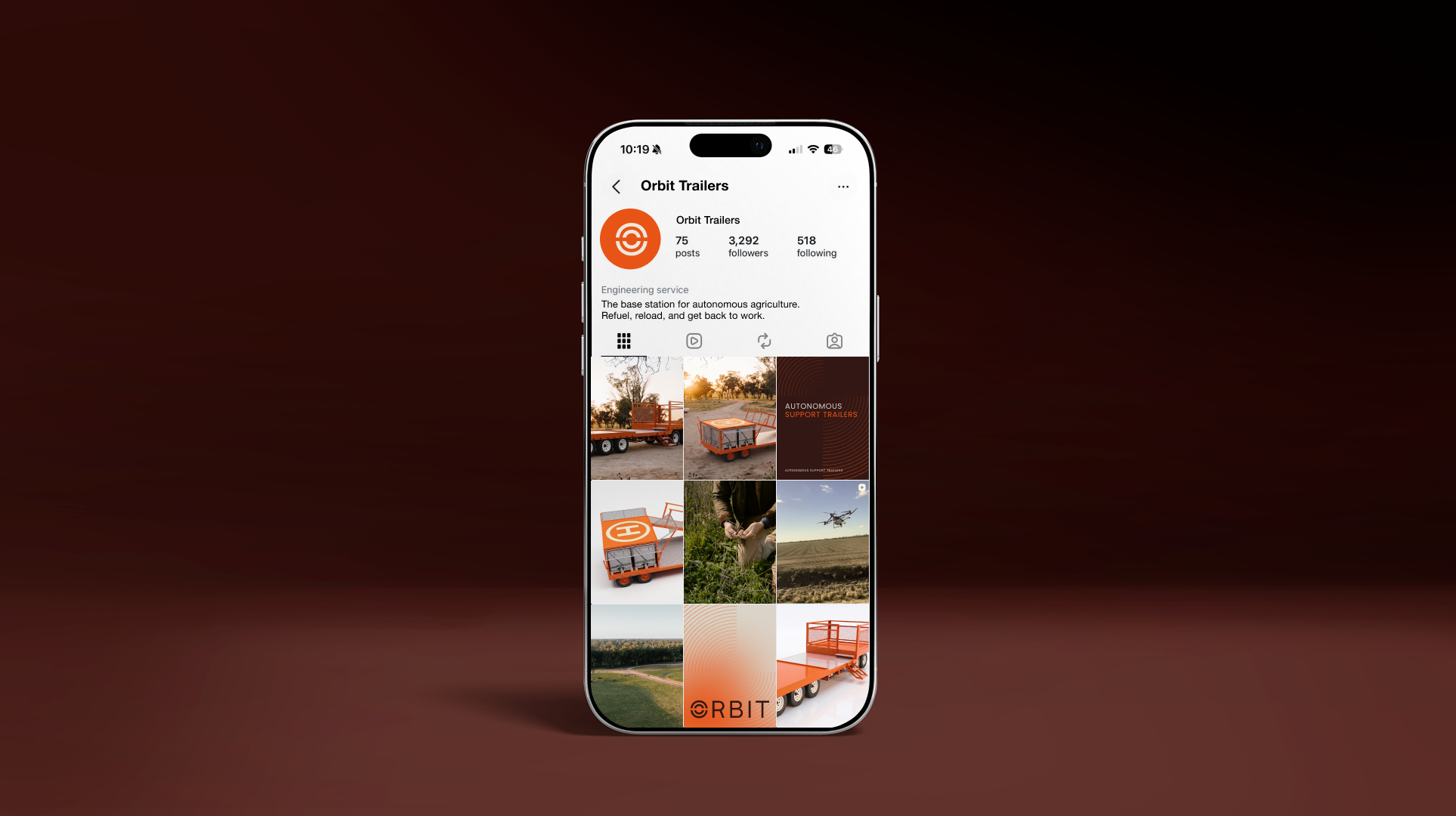
Orbit builds robust support trailers designed to work alongside farm robots and spray drones, carrying the fuel, chemical and water needed to keep autonomous equipment running in the field. Positioned at the heart of the farm autonomy revolution, Orbit acts as the base station a robot or drone returns to, refuels from, and continues its work around.
Orbit
Brand identity
Year created: 2026
Orbit needed to be positioned as an essential companion for anyone operating a SwarmFarm robot or spray drone – the trailer to have alongside these machines, not just one option among many.
The brief called for a deliberately no-nonsense brand mark that could work as hard on a piece of laser-cut metal as it could on a website. Above all, it needed to appeal to agricultural operators – practical, results-driven people who wouldn't respond to an overly polished or tech-heavy brand. It needed to feel simple, robust and attainable, with just enough of a modern, tech-forward edge to signal its place in the emerging autonomy space, without ever tipping into complexity or over-explanation.
The brief
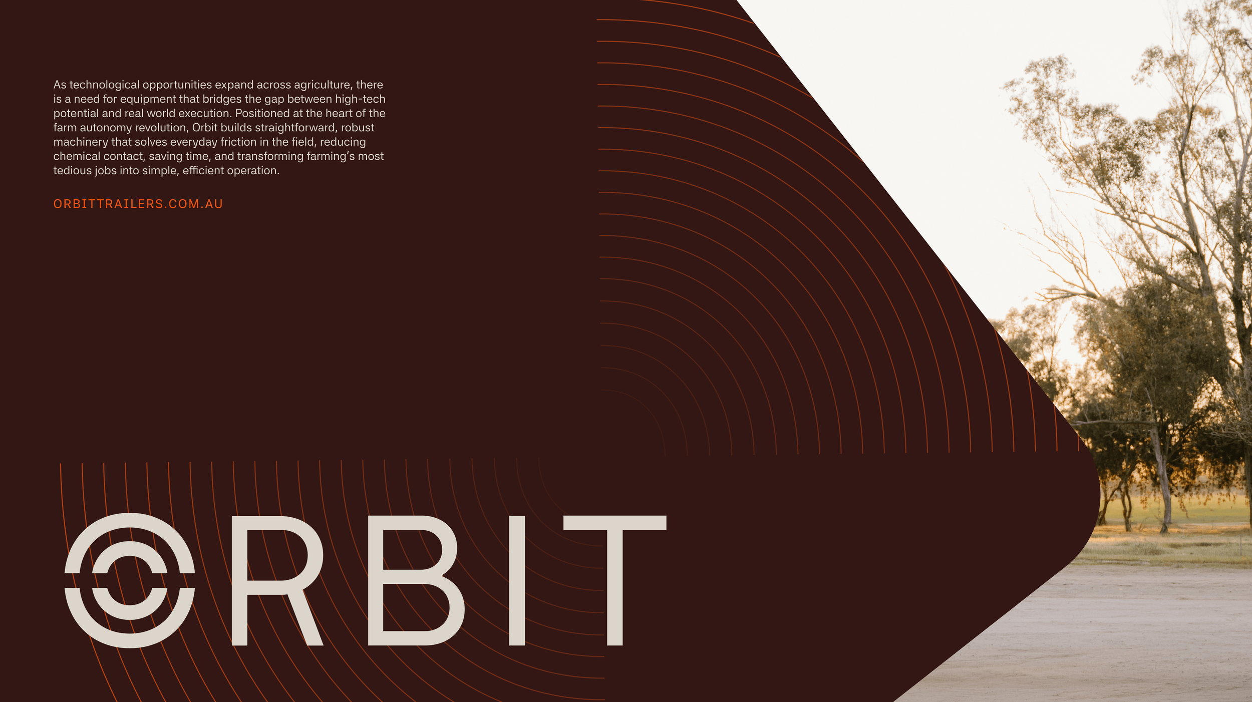
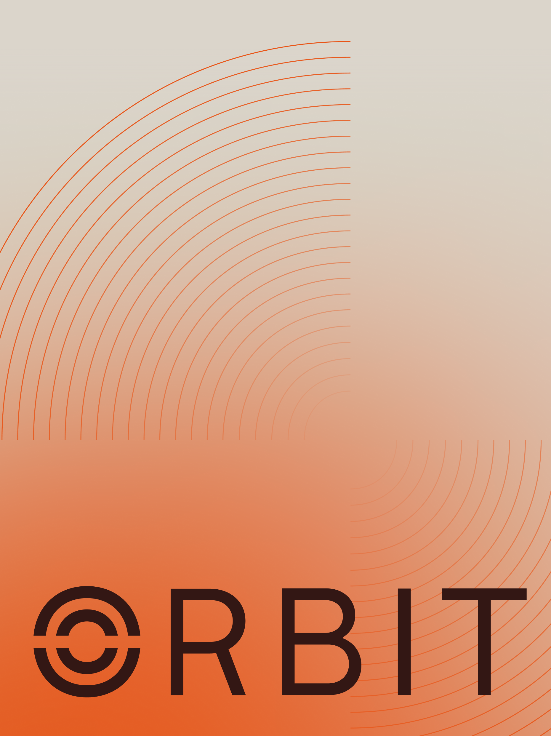
We envisioned the brand mark centreing around a central base or target point, drawing on the rotation and motion blur of drone blades, ripples in water or fuel, connection of a link, and drone base – Coming together to represent Orbit as the central point that everything returns to.
The idea
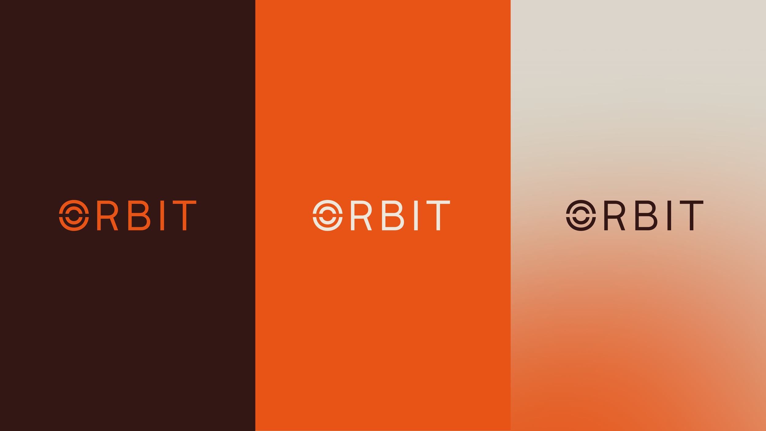
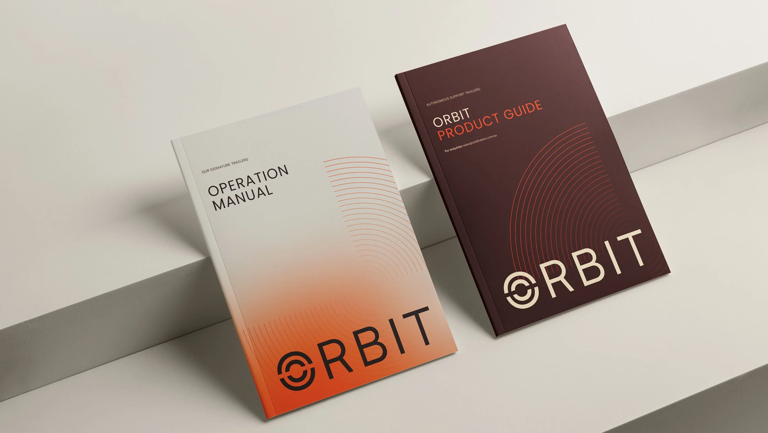
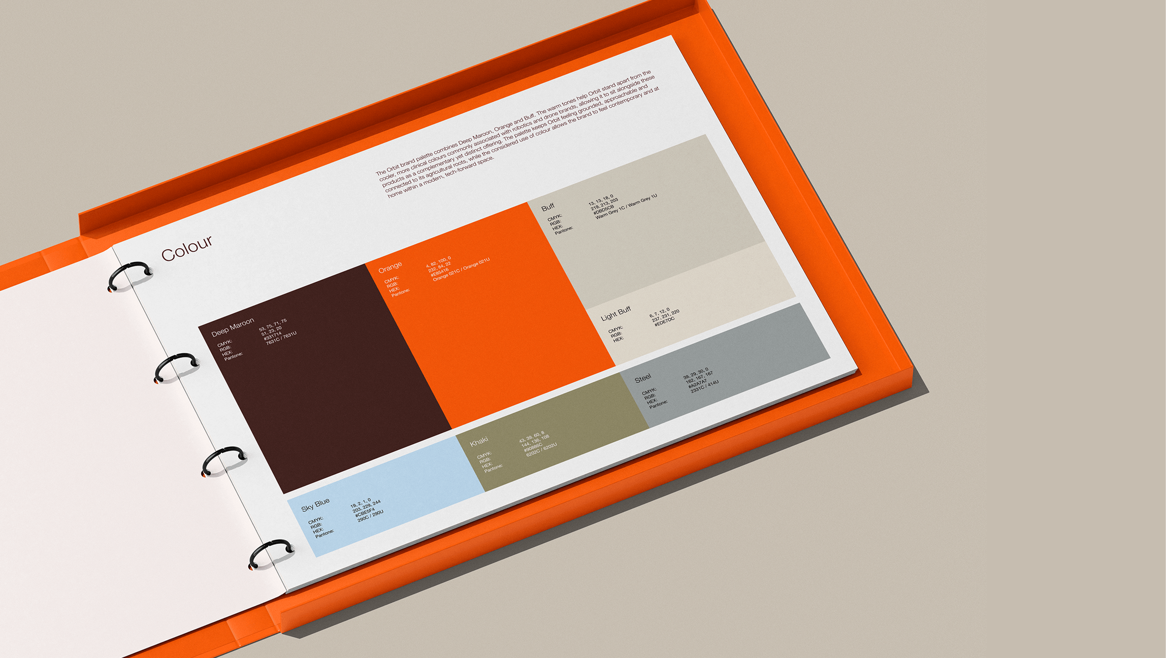
The Orbit brand palette combines Deep Maroon, Orange and Buff. The warm tones help Orbit stand apart from the cooler, more clinical colours commonly associated with robotics and drone brands, allowing it to sit alongside these products as a complementary yet distinct offering. The palette keeps Orbit feeling grounded, approachable and connected to its agricultural roots, while the considered use of colour allows the brand to feel contemporary and at home within a modern, tech-forward space.
Colour palette
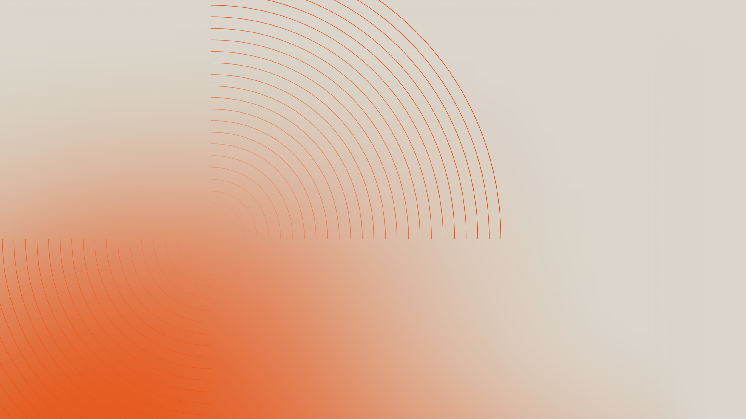
To add further depth and dimension to the brand, a subtly modern, tech-led gradient has been introduced. The gradient adds a sense of movement and energy, while bringing a contemporary edge to the otherwise practical and grounded visual identity.
Graphic elements
The secondary radiating device builds from the ‘O’ in the Orbit brand – Concentric lines reference the ripples created by drone flight paths across paddocks, as well as ripples in water and fuel. Splitting the form creates a sense of movement, inspired by the motion blur of rotating drone blades and what is seen when the drone is in flight